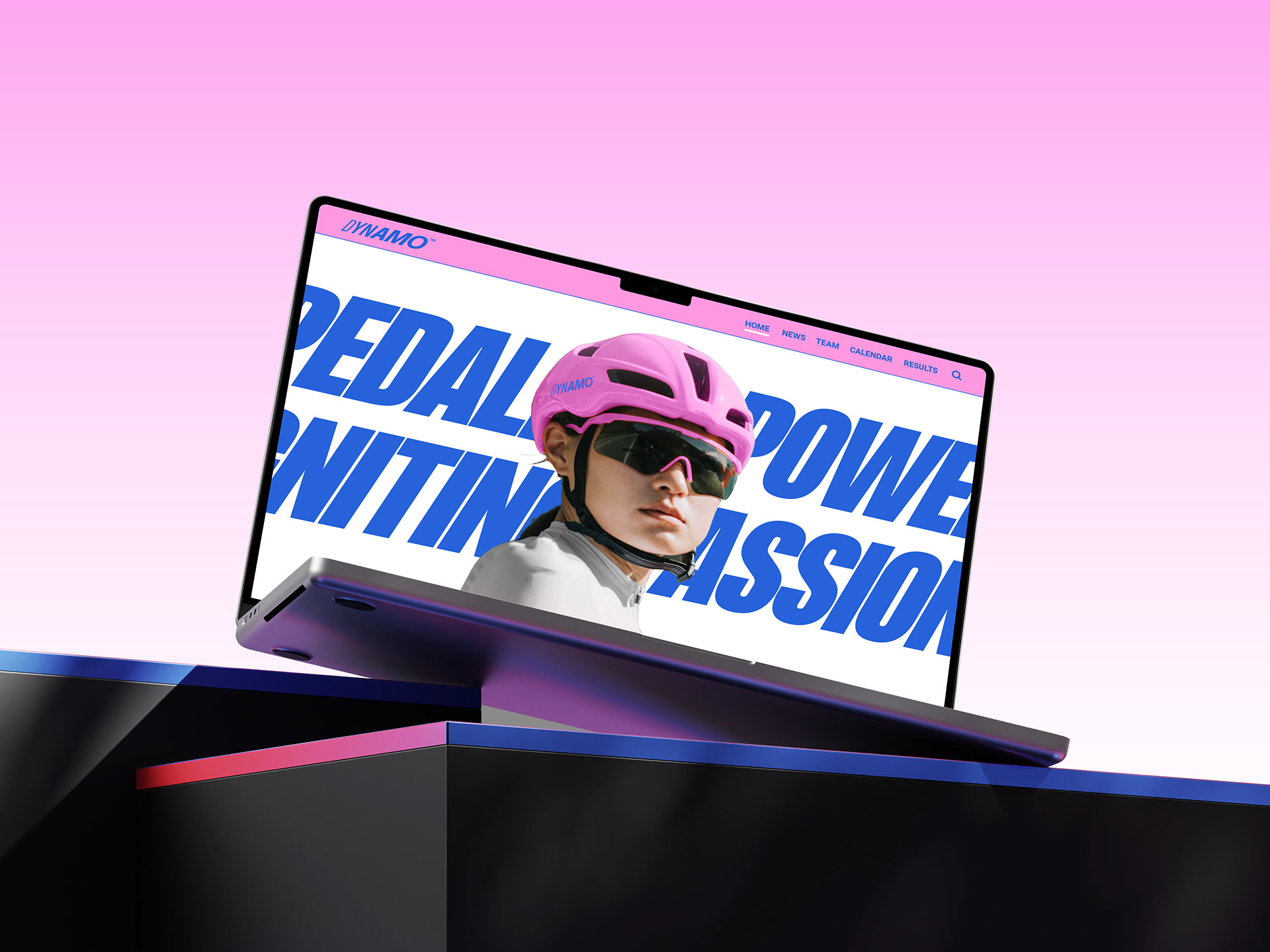
HOW TO TURN RAW HUMAN EFFORT INTO A POWERFUL VISUAL NARRATIVE?
COMO TRANSFORMAR O ESFORÇO HUMANO BRUTO EM UMA NARRATIVA VISUAL PODEROSA?
Across the cycling world, countless teams blend into the background with generic logos and uninspiring gear. In a high-speed sport where split-second recognition is everything, a team’s visual identity cannot be just an afterthought on a jersey; it must be a powerful translation of raw human effort into pure momentum.
No universo do ciclismo, inúmeras equipes desaparecem no meio de logotipos genéricos e uniformes pouco inspiradores. Em um esporte de alta velocidade, no qual o reconhecimento em uma fração de segundo é essencial, a identidade visual de uma equipe não pode ser apenas um detalhe estampado na camisa; ela precisa traduzir com força o esforço humano bruto em puro movimento.
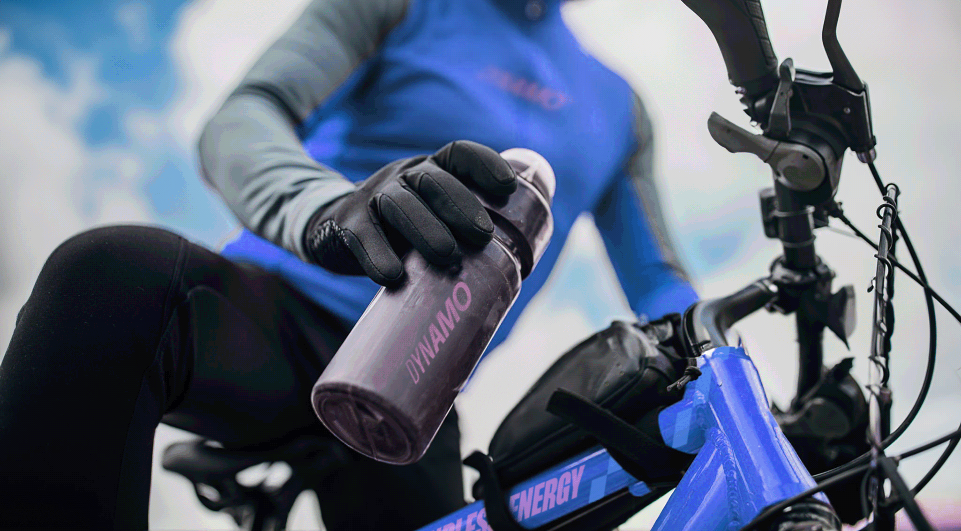
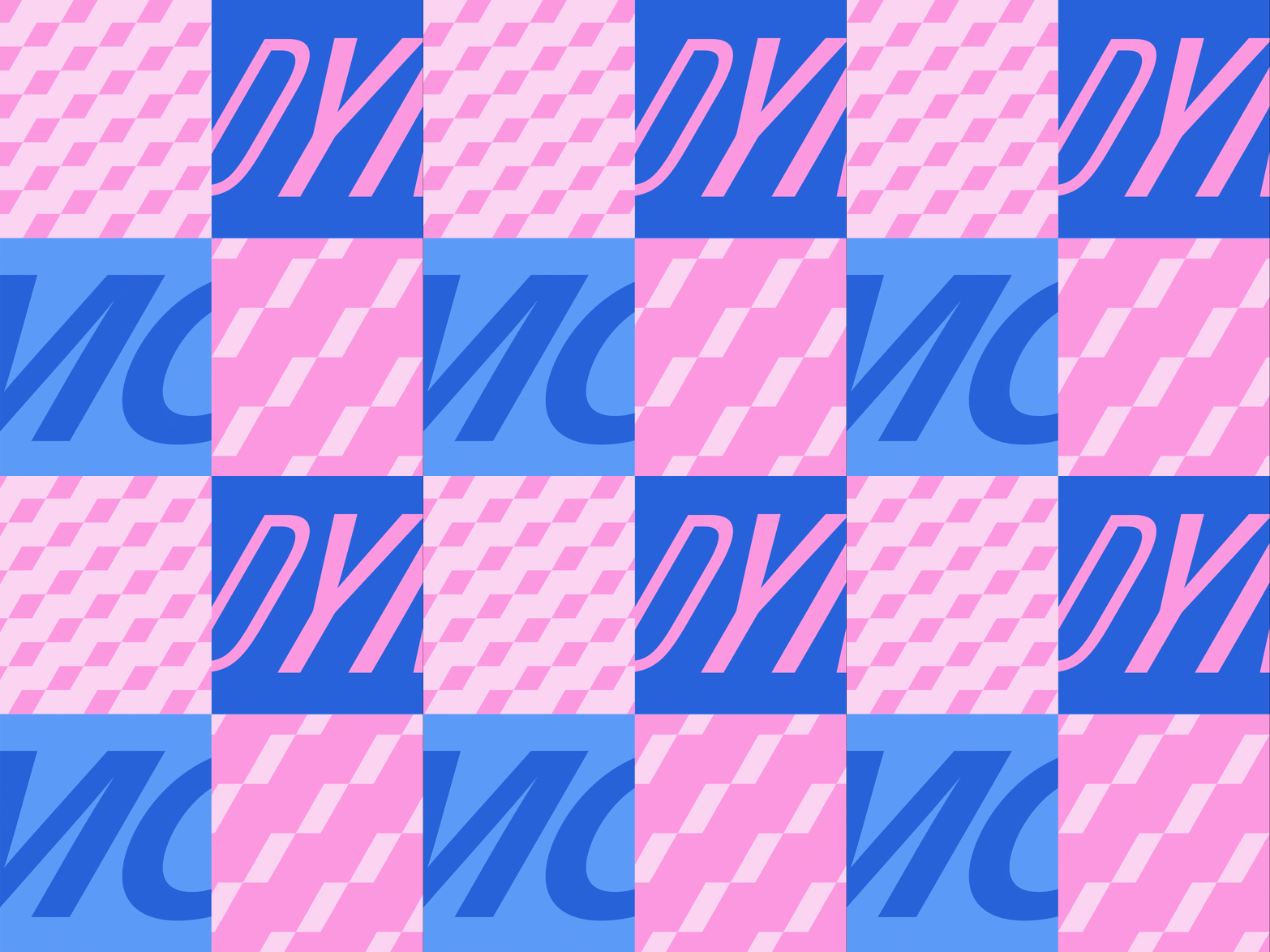
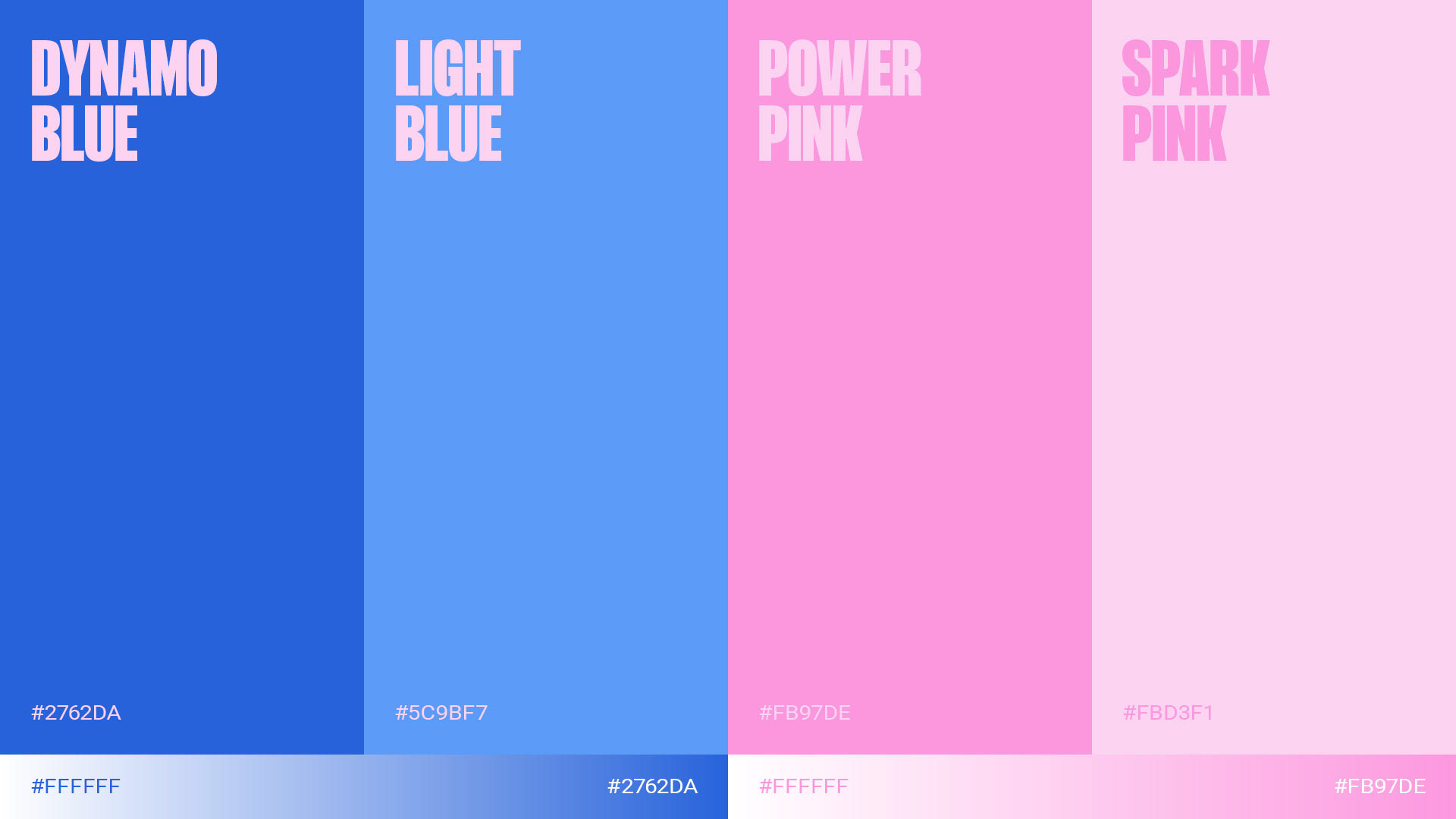
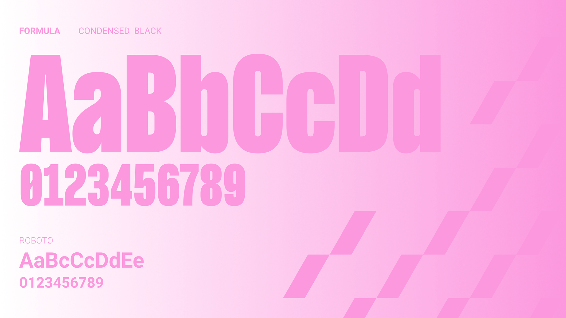
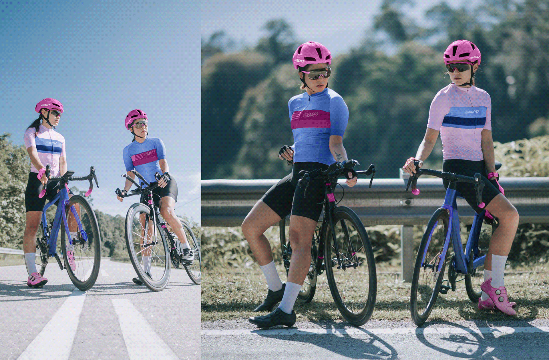
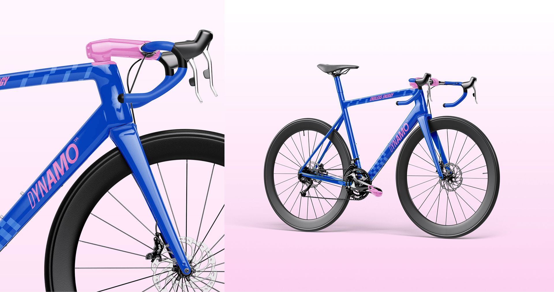
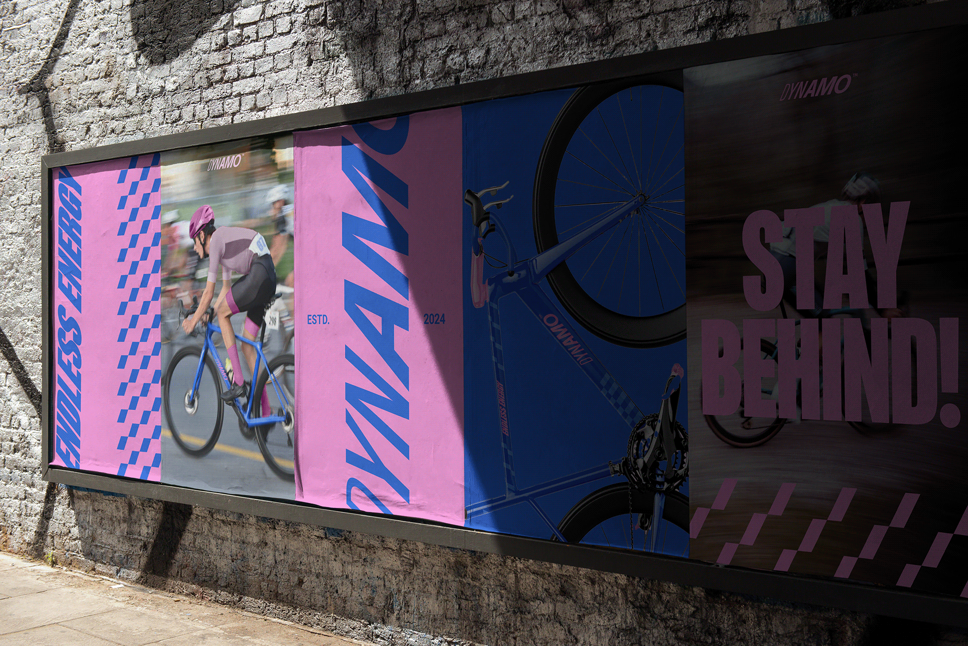
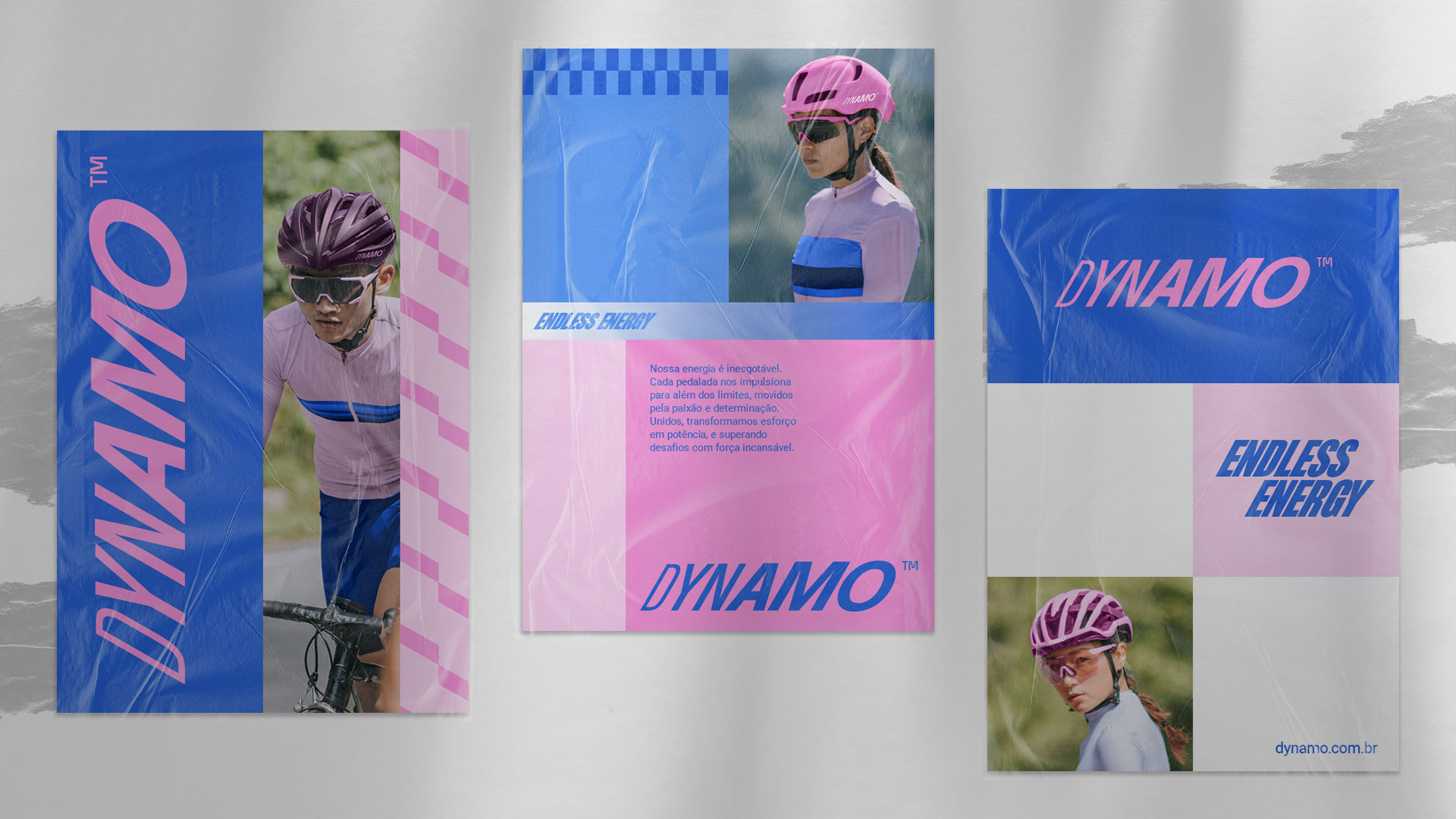
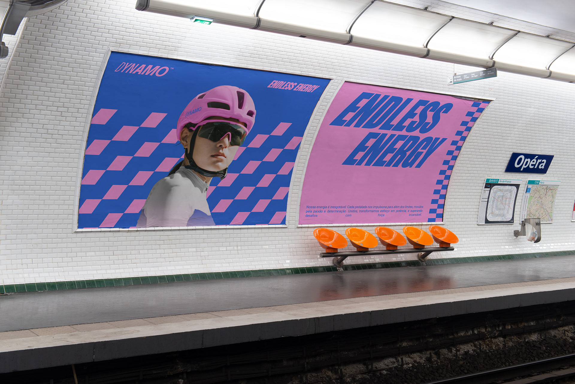
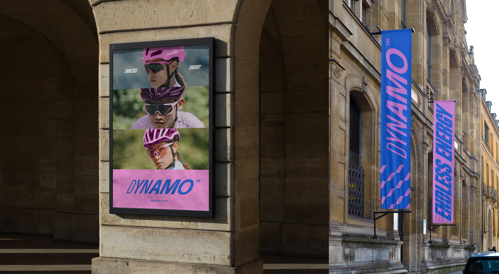
Dynamo was built to solve this exact challenge: to design a bold, fearless, and dynamic visual ecosystem for a road cycling team. Inspired by the dynamo mechanism, which converts mechanical energy into electricity, the brand serves as a metaphor for transforming sheer human force into movement. We created a visual language tailored to connect with passionate cyclists who demand a look as intense and inspiring as the sport itself.
A Dynamo foi criada para resolver exatamente esse desafio: desenvolver um ecossistema visual ousado, destemido e dinâmico para uma equipe de ciclismo de estrada. Inspirada no mecanismo do dínamo, que converte energia mecânica em eletricidade, a marca funciona como uma metáfora da transformação da força humana em movimento. Criamos uma linguagem visual pensada para se conectar com ciclistas apaixonados que buscam uma estética tão intensa e inspiradora quanto o próprio esporte.